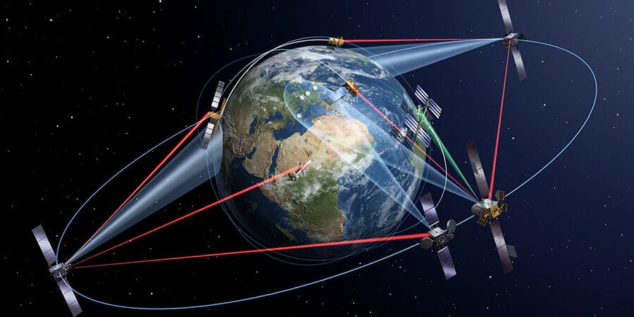
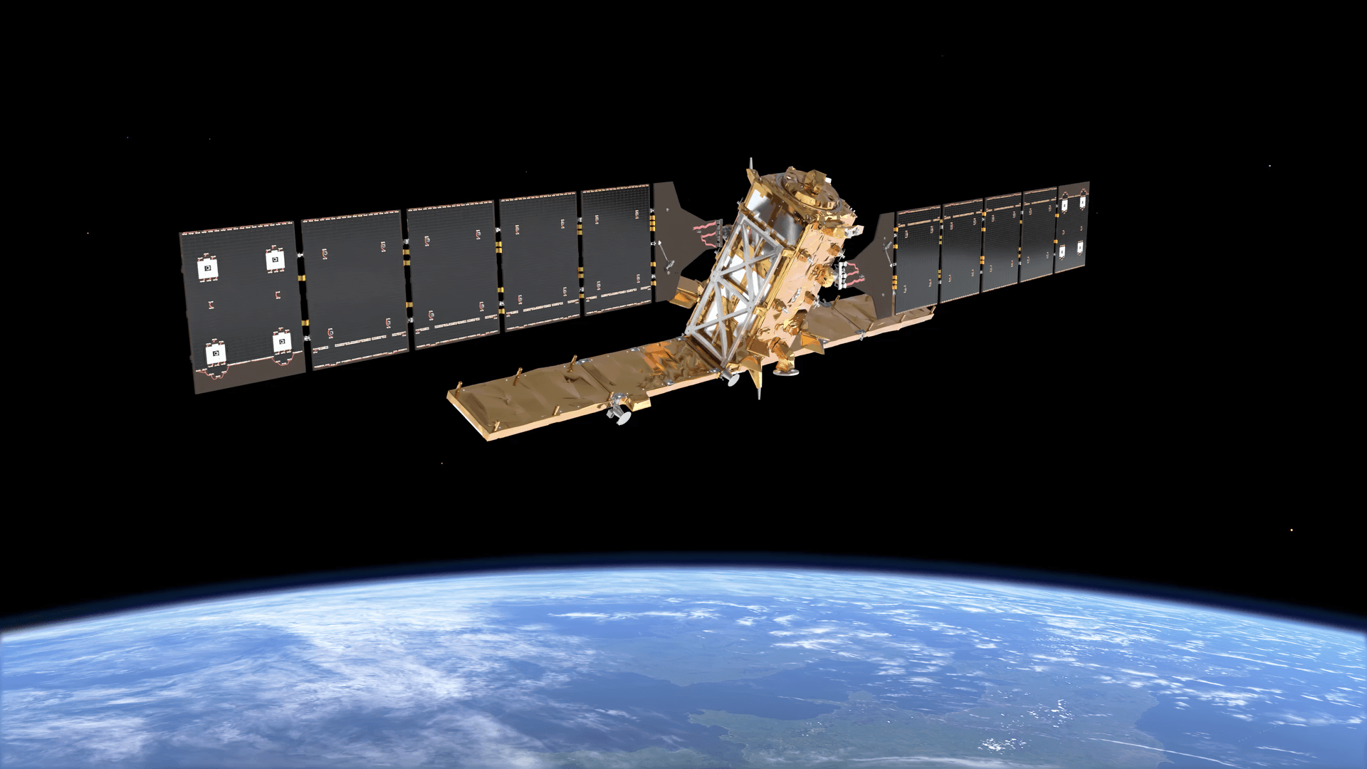
Quick answer: To interpret a satellite image, first check when it was taken and how sharp it is. Next, find north and work out whether you are looking at true color, false color or radar. Then read the visual clues: tone, shape, size, pattern, texture, shadow and what sits nearby. Finally, confirm what you think you see with a map, an older image or local knowledge.
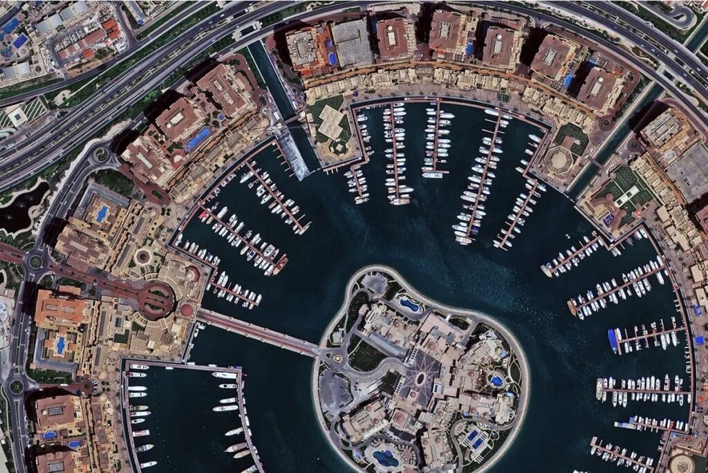
A 30 cm true color satellite image of Doha, Qatar. At this sharpness you can count boats, cars and palm trees.
Satellite images are packed with facts. They show how fast a city grows, how healthy a crop is, where a flood spread and what changed on a site since last month. However, an image only answers questions if you know how to read it. This guide gives you a simple method that works on almost any satellite image, from a free Sentinel-2 scene to a 30 cm commercial shot.
What Is Satellite Image Interpretation?
Satellite image interpretation means looking at an image taken from space and turning what you see into facts you can act on. For example: this field is stressed, this road is flooded, or twelve new buildings went up. Analysts do this through four jobs, and each job builds on the one before it.
Job
What you do
Example
Detection and identification
Spot something and name it
That dark, winding strip is a river
Delineation
Draw its outline on a map
Tracing field edges or the edge of a burn scar
Enumeration
Count how many there are
Cars in a parking lot, trees in an orchard
Mensuration
Measure length, area or height
Hectares burned, or a tower's height from its shadow
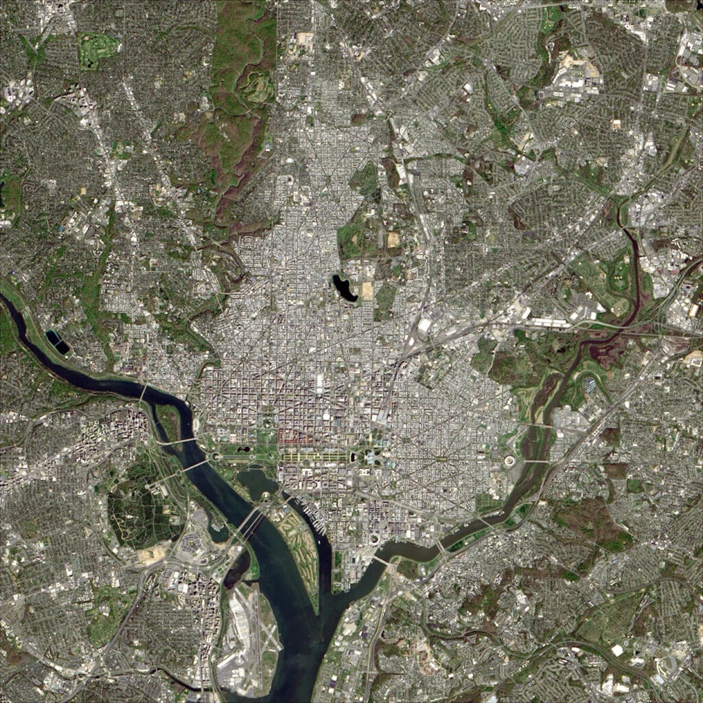
Detection starts with features you can name for sure. In this Landsat 9 image of Washington DC, the Potomac River, the parks and the street grid stand out even at 30 m per pixel.
How to Interpret Satellite Images in 7 Steps
Follow these steps in order. Each one removes a common source of error, so by the end you can trust what you are reading.
- Check the image details: date, time, sensor, angle and cloud cover.
- Work out the scale and resolution: how much ground one pixel covers.
- Find north and check the light: so the landscape reads the right way up.
- Name the image type: true color, false color, index map or radar.
- Read the eight visual clues: tone, shape, size, pattern, texture, shadow, association and site.
- Compare two dates: to see what is new, gone or different.
- Check accuracy before you measure: so your numbers hold up on the ground.
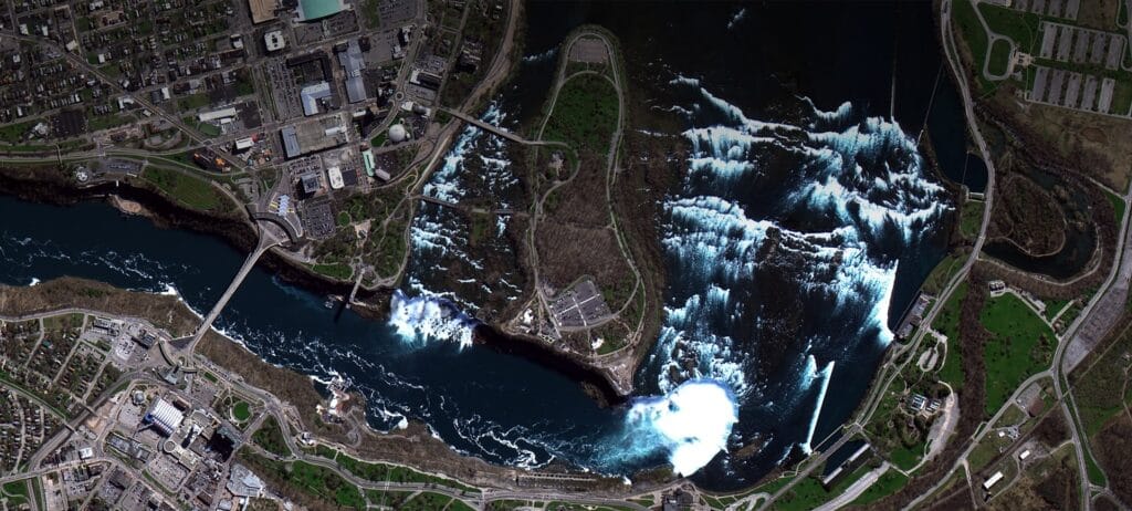
Start with the easy anchors, like the river and the falls in this image of Niagara Falls, then work outward to the details.
Step 1: Check the Image Details First
Every satellite image comes with a data sheet called metadata. Read it before you study a single pixel, because it explains much of what you are about to see.
- Date and season: A brown field in winter is normal. The same field brown in midsummer may point to drought or crop failure.
- Local time and sun angle: A low sun casts long shadows. That helps you judge height, but it also hides detail on the dark side of buildings and hills.
- Sensor and bands: These tell you which colors are real and which come from light your eyes cannot see.
- Cloud cover: The cloud score covers the whole scene. A scene with only 10% cloud can still have your site fully hidden, so zoom in and check your own area.
- Off-nadir angle: This is how far the satellite tilted to take the shot. Near zero means a straight-down view. At higher angles you see the sides of buildings, tall objects seem to lean, and the image gets a little softer.
- Processing level: Raw images can be off by many meters. Orthorectified images are corrected for tilt and terrain, so they are the ones to measure on.
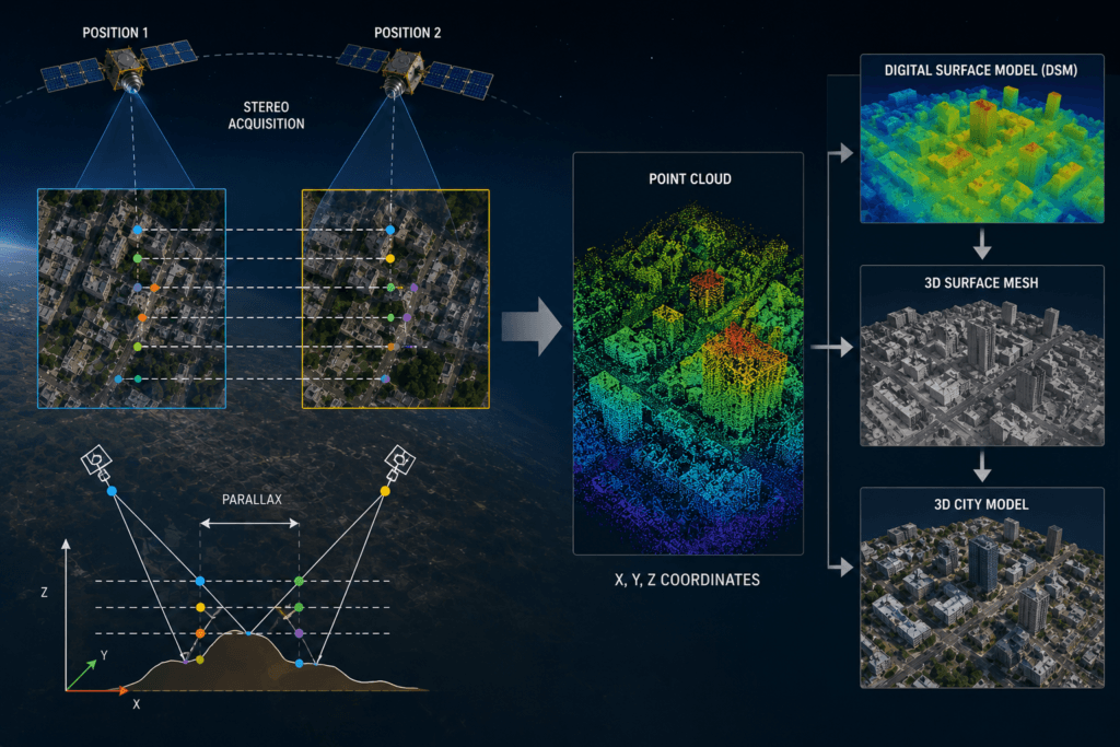
The viewing angle is part of the metadata. Here one satellite shoots the same block from two angles, which is also how 3D surface models are made.
Step 2: Work Out the Scale and Resolution
Spatial resolution, also called ground sample distance, is the size of one pixel on the ground. At 30 cm resolution, each pixel covers a square 30 cm wide. So anything smaller than one pixel will not show up. As a rule of thumb, an object needs to be three to four pixels wide before you can name it with confidence.
Resolution
Example satellites
What you can pick out
30 m
Landsat 8 and 9
Lakes, forests, city outlines, large farms
10 m
Sentinel-2
Single fields, wide roads, crop health
About 3 m
PlanetScope
Building blocks, small fields, new clearings
80 cm to 1 m
TripleSat
Single houses, trucks, large boats
50 cm
Pléiades, Beijing-3A
Cars, road lanes, small sheds
30 cm
WorldView Legion, Pléiades Neo, SuperView Neo
Car shapes, road markings, rooftop units
Scale also decides which question you can answer. Take a flood, for example. A 30 cm image shows which homes have water at the door. A 10 m image shows how much of the district is under water. Meanwhile, a coarse weather satellite image shows the whole river basin and the storm that caused it. So pick the scale that fits your question, not simply the sharpest image. To see which satellites lead on sharpness today, read our guide on who has the highest resolution satellite imagery.
Two terms often confuse buyers. Pansharpening merges a sharp black and white band with softer color bands, which gives you one sharp color image. HD or super resolution products, sold down to 15 cm, use smart upscaling of 30 cm data. They look cleaner and are easier to read, but they cannot reveal an object the satellite never captured.
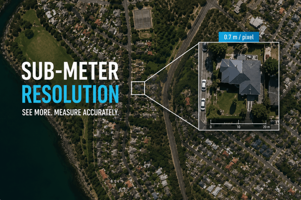
At 70 cm per pixel you can see single houses, pools and cars, but not the small details on a roof.
Step 3: Find North and Check the Light
Most satellite images put north at the top, but not all of them do. So check the north arrow or the map grid first. Once you know where north is, you can tell which way a valley runs or which bank of a river a town sits on. As a result, matching the image to a map becomes much easier.
Next, see where the sunlight comes from. Our brains expect light from the top of a picture. When the sun shines from the bottom of the frame instead, valleys can look like ridges and ridges can look like valleys. This trick of the eye is called relief inversion. Luckily, the fix is simple: rotate the image until the shadows fall toward the bottom of the frame.
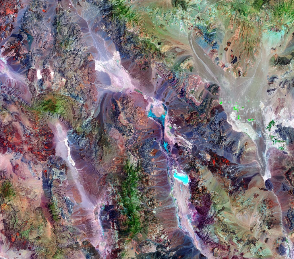
Mountains and dry valleys in Death Valley, seen by Landsat 8. Shadows give the terrain its depth, so the light direction changes how you read the shapes.
Step 4: Know Which Type of Image You Are Reading
The same color can mean very different things in different image types. Red is a roof in one image and a healthy forest in another. So before you judge any color, name the image type. You will meet four types most often: true color, false color, index maps and radar.
How to read a true color satellite image
True color images use red, green and blue light, just like your eyes. As a result, they look like a photo taken from a plane, which makes them the best place to start. Use this color key:
Feature
How it looks
Watch out for
Deep, clear water
Black or dark blue
Shallow water over sand looks much lighter
Muddy water
Brown near the shore, fading to green, then blue
Floodwater can look like bare soil
Forest
Dark green
Turns orange, tan or brown in autumn and winter
Grass and crops
Lighter, brighter green
Farm fields are often brighter than wild land
Bare ground
Tan, brown, red or white
Red soil holds iron; white ground often means salt
Burn scars
Dark brown or black
They fade to brown as plants grow back
Towns and cities
Grey or silver
Red or brown where roofs use clay tiles
Snow and ice
White, grey or pale blue
Dirt and rock debris can tint it tan
Clouds
Bright white with a lumpy texture
Thin, high clouds may show only as a shadow
Smoke, haze and dust
Smooth grey, brown, tan or dull white
Oil fire smoke is black; ash plumes are brown
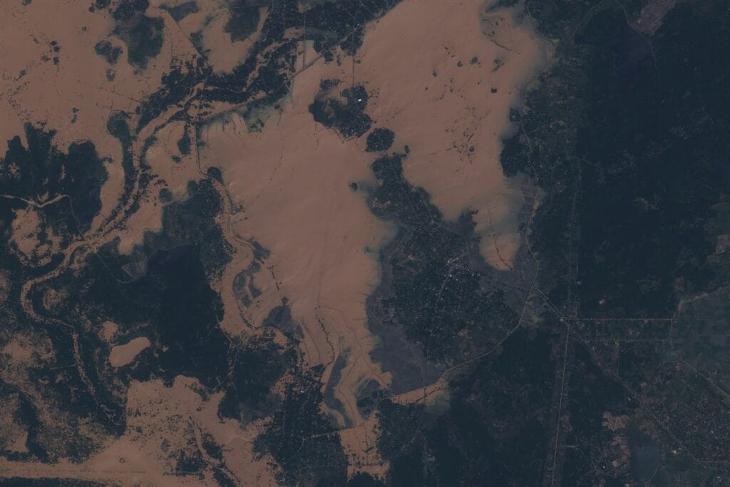
Floodwater in Sri Lanka. The brown color comes from mud carried in the water, which is why floods can pass for bare soil at first glance.
How to read a false color (color infrared) image
False color images add near-infrared light, which our eyes cannot see. Healthy leaves reflect a lot of it, so the image shows plants in bright red. It feels strange at first. However, it makes plant health, shorelines and burn scars far easier to spot than true color does.
Feature
How it looks in color infrared
Healthy, dense plants
Bright red; conifer forest is a darker red than leafy forest
Thin grass or stressed crops
Pink or pale red
Bare soil
Tan, brown or grey
Cities and roads
Cyan or blue-grey
Water
Black when clear, lighter blue when muddy
Snow and clouds
White or pale cyan
Fresh burn scars
Dark brown to black
Each false color view comes from a band recipe. For color infrared, use bands 8, 4 and 3 on Sentinel-2, or bands 5, 4 and 3 on Landsat 8 and 9. A shortwave infrared mix (Sentinel-2 bands 12, 8A and 4) cuts through light haze and makes fresh burns and wet soil stand out. Likewise, a land and water mix (Sentinel-2 bands 8, 11 and 4) paints land in green and orange, water in blue and ice in magenta, so it is handy for shorelines and flood edges.
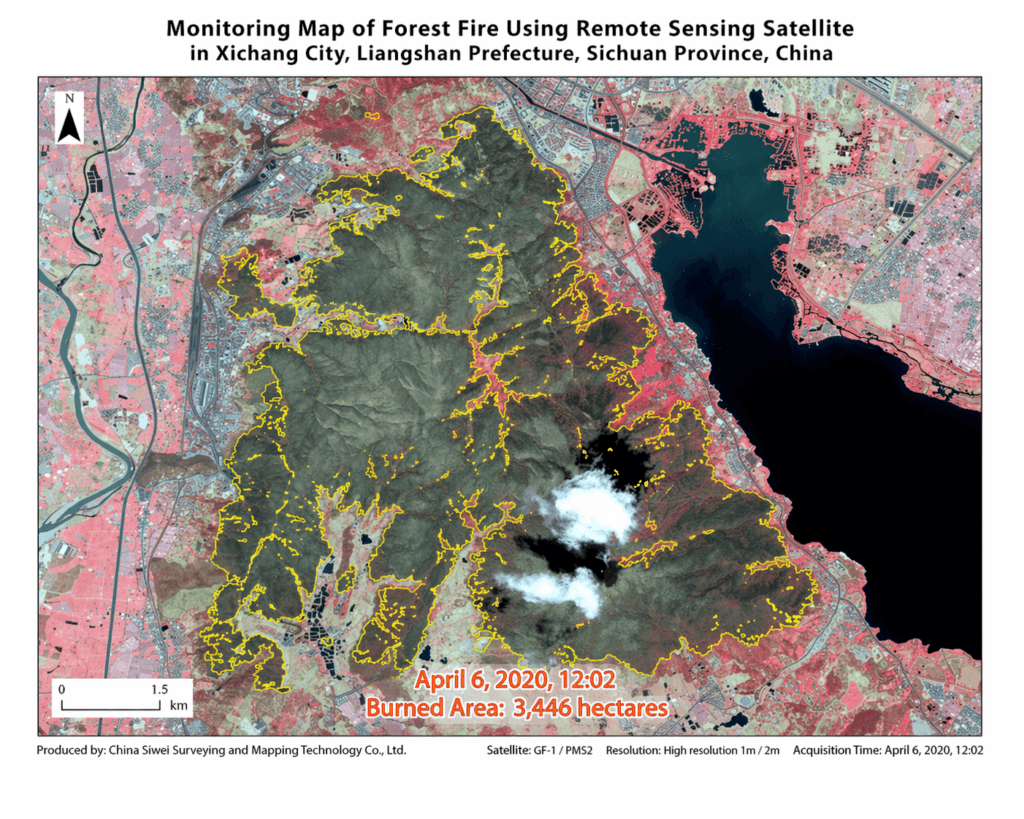
A false color map of a forest fire in Xichang, China. Living forest shows in red, while the burned area is dark grey and brown.
How to read an NDVI or other index map
An index map turns band math into one simple color scale. The best known is NDVI, the Normalized Difference Vegetation Index. It compares near-infrared light with red light: NDVI = (NIR − Red) ÷ (NIR + Red). The result always falls between −1 and +1. On most maps, green means high values and red or brown means low ones.
NDVI value
What it usually means
Below 0
Water, snow or thick cloud
0 to 0.1
Bare rock, sand or concrete
0.1 to 0.2
Bare soil or freshly plowed fields
0.2 to 0.5
Sparse grass, shrubs, young or stressed crops
Above 0.5
Dense, healthy plants such as forests and crops at their peak
Read NDVI as a comparison, not a school grade. Compare a field with itself over time, or with the field next door, and use images without haze, because clouds and haze drag the numbers down. Also note that NDVI stops rising over very thick canopy. In dense forest or peak-season crops, the Enhanced Vegetation Index (EVI) separates healthy from very healthy much better.
Other ready-made maps work the same way. A forest change index compares two dates and flags where trees were cleared or grew back. A scene classification layer, like the one that ships with Sentinel-2 data, labels each pixel as cloud, shadow, plants, soil, water or snow. That lets you hide clouds and shadows before you start, so they do not skew your reading.
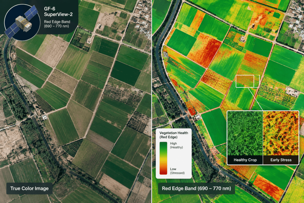
True color (left) next to a red edge index map (right). The index reveals early stress in fields that still look green to the eye.
How to read a radar (SAR) image
Radar satellites send out their own microwave signal and record the echo. Because of that, they work at night and see through clouds and smoke. However, a radar image does not show color. Instead, it shows how rough, tall or metallic a surface is. Use these rules:
- Bright: buildings, ships, bridges and flooded forests. Their flat walls and corners bounce the signal straight back.
- Medium grey: fields, grass and forest canopy, which scatter the signal in many directions.
- Dark: calm water, oil slicks, runways and smooth roads. The signal glances off them like light off a mirror.
- Grainy salt-and-pepper look: this is speckle, a normal part of radar. It is noise, not texture on the ground.
- Leaning shapes: tall buildings and mountains lean toward the satellite, and slopes facing it look squashed. Behind them sits a black radar shadow with no data at all.
Colorful radar images are made by mixing two or more polarizations, such as VV and VH. The colors are a code, not real colors, so always check the legend. For a deeper guide, see our page on SAR satellite imagery.
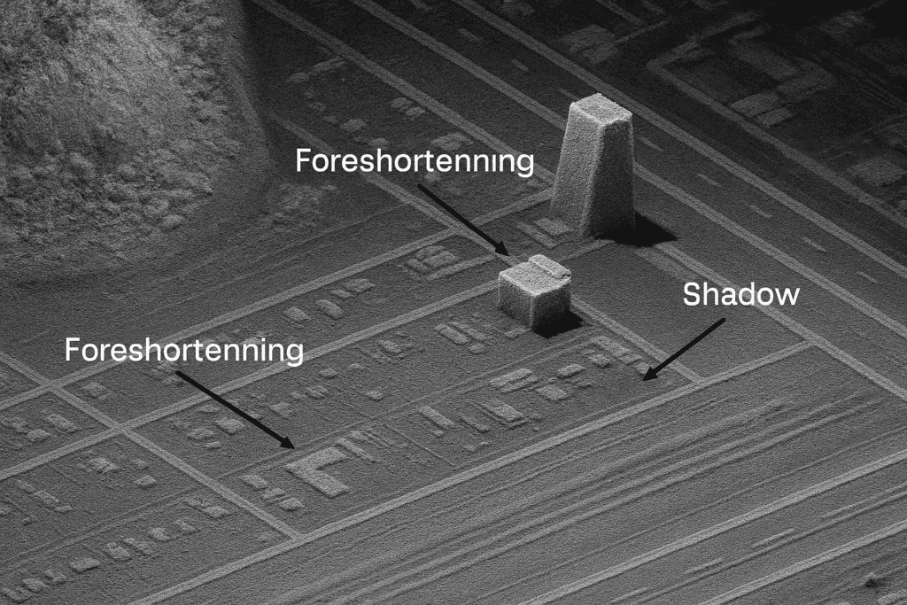
In radar images, tall buildings lean toward the sensor (foreshortening) and cast a radar shadow on the far side.
Step 5: Read the 8 Visual Clues
Experts use eight clues, often called the elements of image interpretation, to name what they see. One clue alone can fool you. Two or three that agree rarely do.
Clue
What to look at
Example
Tone and color
How light or dark, and which color
Dark green forest beside pale green grass
Shape
The outline
Round center-pivot fields; a perfectly straight line is almost always made by people
Size
How big it is next to things you know
A house next to a warehouse or a stadium
Pattern
How things repeat
Rows in an orchard, a street grid, fishbone logging roads
Texture
Smooth or rough
A calm lake is smooth; a forest canopy is rough
Shadow
The shape and length of the dark side
A tower's shadow shows its form and height
Association
What sits nearby
Round tanks next to a pier suggest an oil terminal
Site
Where it sits in the landscape
Rice paddies on flat, wet low ground; volcanoes as round peaks
Shadows also let you measure height. Find the sun elevation angle in the metadata, then multiply the shadow length by the tangent of that angle. For example, with the sun at 45 degrees, a 20 m shadow means an object about 20 m tall. This works best on flat ground and in images taken looking straight down.
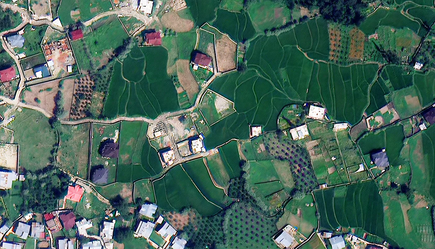
Shape, pattern and texture at work. At 30 cm, fields, tree rows and village roofs are easy to tell apart.
How to Tell Look-Alikes Apart
A satellite sees clouds, haze and ground all squashed into one flat layer. So very different things can look almost the same. These are the mix-ups that trip people up most:
If you see
It might be
How to check
A bright white patch
Cloud, snow, a salt flat, white sand or sun glint
Clouds cast matching shadows and move between dates. Snow sits on high ground. Glint shows only on water, solar panels and shiny roofs.
A dark patch
Water, a cloud shadow, a burn scar or thick forest
Look for the cloud that made the shadow. Then switch to false color: forest turns red, water stays black.
A grey blur
Haze, fog, smoke or thin cloud
Smoke streams away from a source. Fog pools in valleys. Haze spreads evenly over a wide area.
A glare on water
Sun glint
Pick an image taken from another angle. Glint can also reveal oil slicks and wave patterns.
Tan swirls over land or sea
Dust
Follow the swirl back to a desert or a dry lake bed.
Two fixes help when the view is poor. First, if cloud blocks your site, radar can fill the gap on the same day. Second, if haze softens the view, ask for an image with atmospheric correction, which removes much of the haze and brings back contrast.
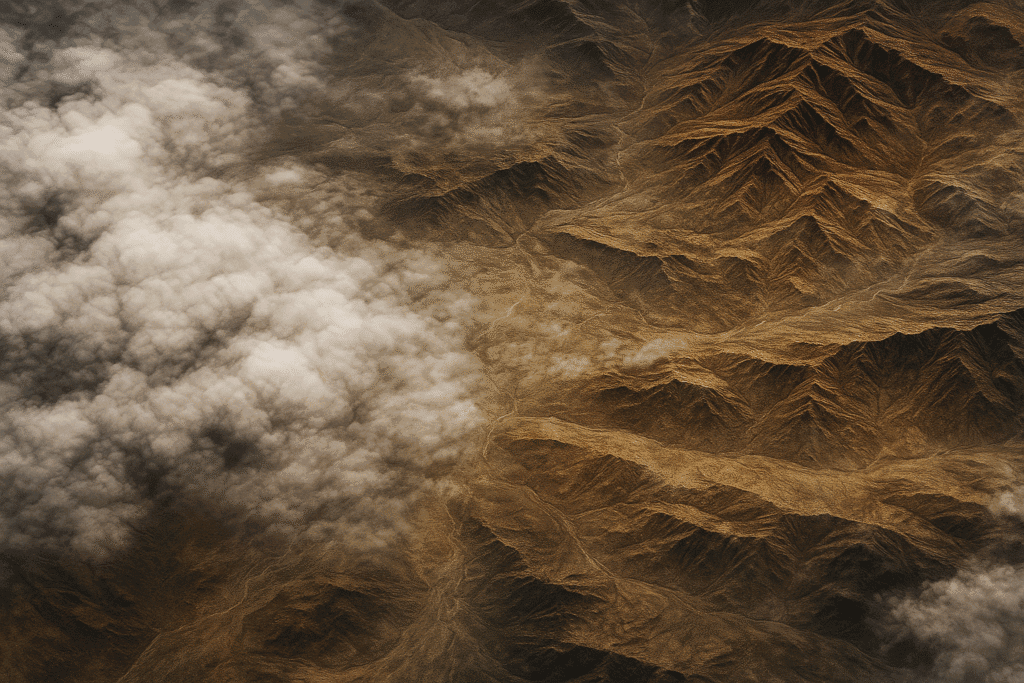
Clouds, their shadows and bare mountains in one frame. Cloud shadows copy the shape of the cloud above, which is how you tell them apart from lakes or burns.
Step 6: Compare Two Dates to Spot Change
One image shows a moment. Two images tell a story. Change detection means lining up an older and a newer image of the same place, then looking for what is new, gone or different. Follow these rules so real change stands out from false alarms:
- Match the season, so normal leaf fall does not look like damage.
- Match the time of day and viewing angle, so shadows and leaning buildings line up.
- Use the same type of sensor where you can, since colors vary from one satellite to another.
- Line the images up exactly. Even a few meters of offset creates fake change along every edge.
Want to practice? Google Earth Pro has a free historical imagery slider. Try it on your own street and see how many changes you can find.
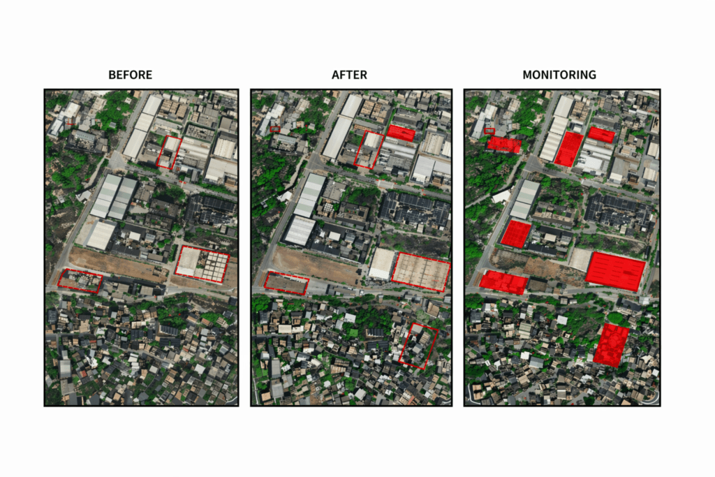
Before, after and the change map. New buildings are flagged in red.
Step 7: Check Accuracy Before You Measure
Resolution tells you how sharp an image is. Accuracy tells you whether each pixel sits in the right spot on Earth. They are not the same thing, and you need both before you measure areas, distances or heights.
- Absolute accuracy is how close a point in the image is to its real spot on the ground. It is often quoted as CE90. For example, 5 m CE90 means that 9 times out of 10, a point lands within 5 m of where it really is.
- Relative accuracy is how right the distances are between things inside the same image. It matters most when you measure lengths and areas.
- Ground control points are spots with known coordinates, such as surveyed road corners. They pin the image firmly to the ground.
- Orthorectification uses an elevation model to remove tilt and terrain bending. It matters most in hilly areas and for images taken at an angle. Learn more about orthorectification of satellite imagery.
A simple rule to remember: never measure on a raw, tilted image. First make sure it is orthorectified, then measure.
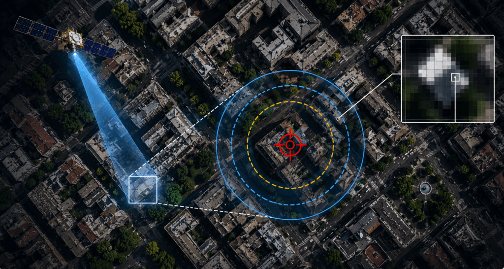
CE90 shown as a circle around a target. The smaller the circle, the closer each pixel sits to its true location.
Best Software to Read Satellite Images
You do not need costly tools to start. These are the ones we recommend, listed from easiest to most advanced.
Tool
Best for
Cost
Copernicus Browser
Opening free Sentinel images in your web browser, with one-click true color, false color and NDVI views
Free
Google Earth Pro
Exploring places in 3D, adding pins and measuring simple distances
Free
QGIS
Measuring, tracing outlines, counting features and making maps on your own computer
Free and open source
ESA SNAP
Cleaning and reading Sentinel-1 radar images, including speckle filtering
Free
Google Earth Engine
Large areas and long time series, written in code
Free for research, paid for business use
ArcGIS Pro
Teams that need a full GIS with built-in AI tools and support
Paid
Our pick: start with Copernicus Browser to learn how colors and band mixes behave. Then move to QGIS once you need to measure or map. Finally, add SNAP when you start working with radar.
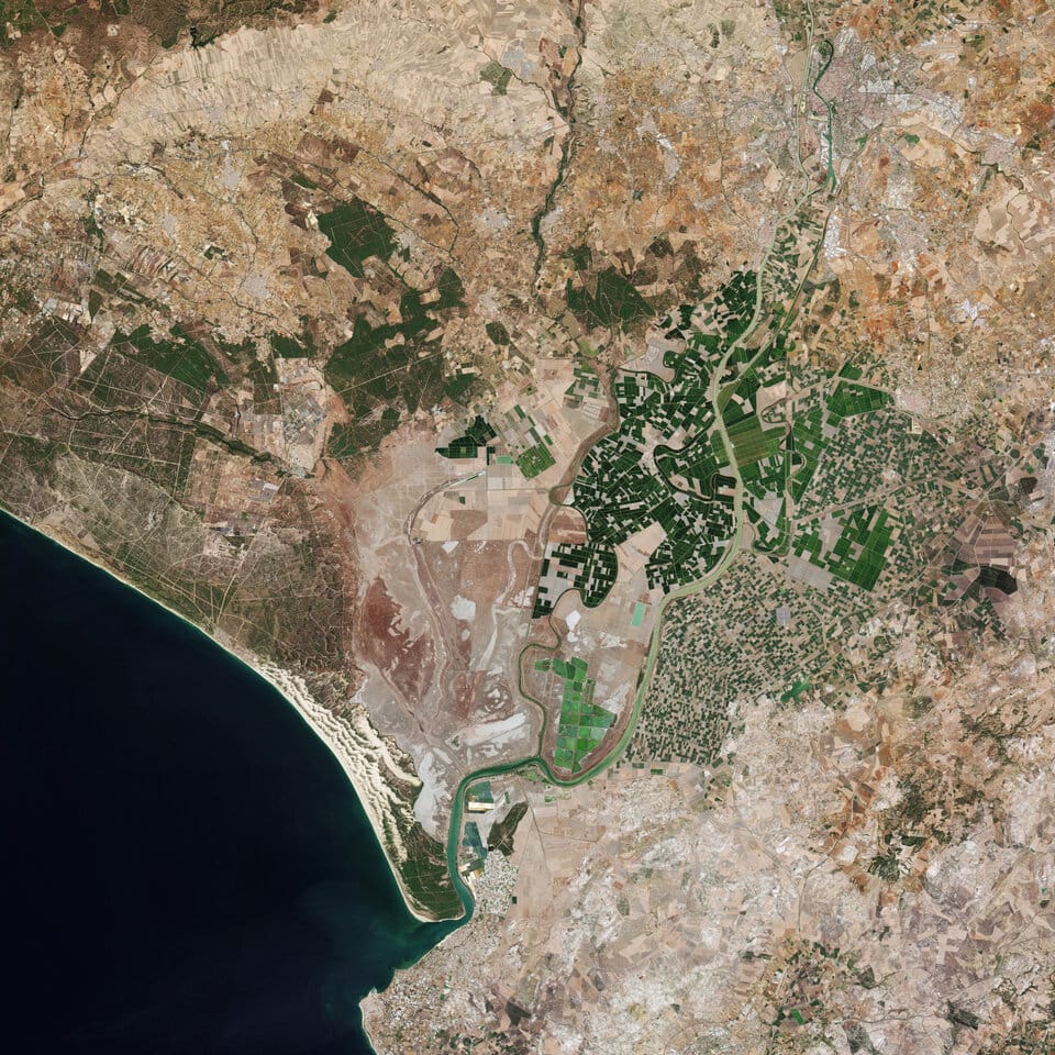
A Sentinel-2 view of Seville, Spain. Images like this are free to open and explore in Copernicus Browser.
How AI Helps You Interpret Satellite Images
AI now handles much of the first pass. Trained models can find and count cars, ships and buildings, trace field edges, and flag change across whole countries in hours instead of months. On top of that, newer foundation models learn from huge stacks of satellite data first and then adapt to new jobs with little extra training. Two well known examples are Prithvi, built by NASA and IBM, and AlphaEarth Foundations from Google DeepMind, which sums up every 10 m patch of land using many satellite sources at once.
Even so, AI trips over the same clouds, shadows and look-alikes that people do, only faster. So treat AI results as a first draft. Spot-check them against the seven steps above before you act on them.
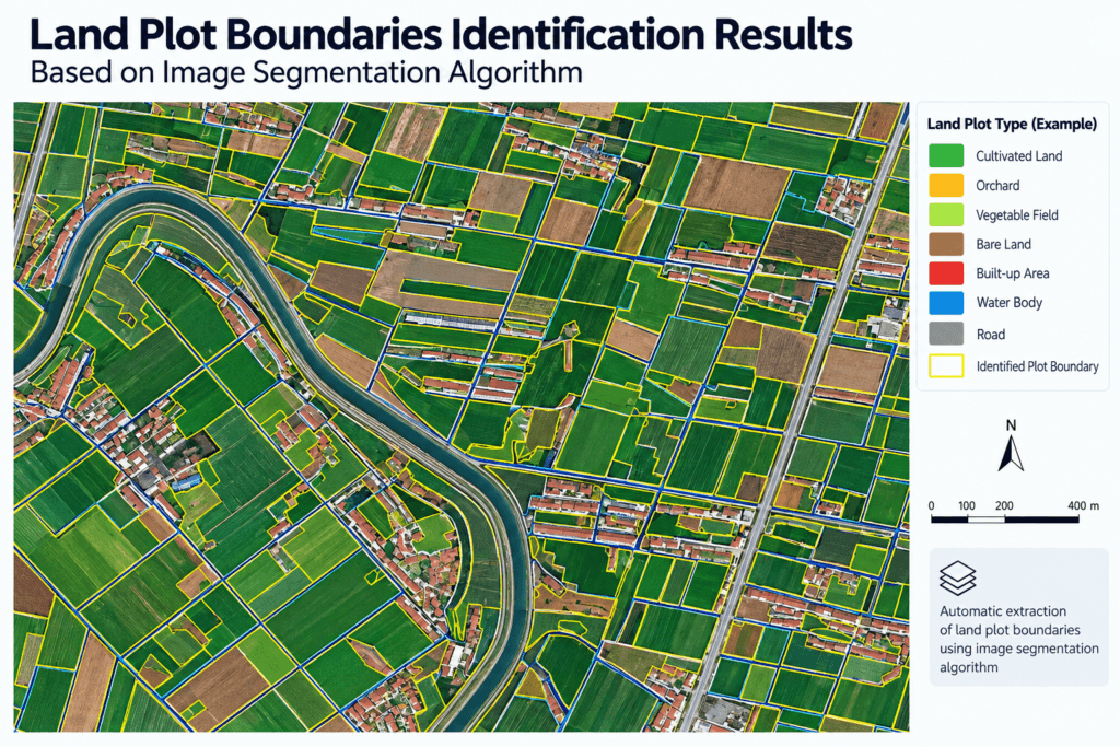
AI segmentation traced these field boundaries and sorted each plot by land type. A quick human check still catches the errors.
Frequently Asked Questions
How often are new satellite images taken of the same place?
It depends on the satellite. Free Sentinel-2 images repeat about every 5 days at the equator and more often further north and south. Landsat 8 and 9 together repeat every 8 days. Commercial satellites can be tasked to shoot a site within a day or two, and weather satellites refresh every few minutes, but at a much coarser scale.
Can satellite images show people or faces?
No. Even at 30 cm, the sharpest widely sold resolution, a person from above covers only one or two pixels. So you may see a dot or a shadow in an open space, but you cannot recognize anyone.
Why does Google Maps satellite view look old or blurry in some places?
Map apps stitch together many images from different dates and sources into one seamless layer. Busy cities often get sharp, fresh aerial photos, while rural areas may show older or softer satellite images. For a known date and resolution, you need the original satellite image, not the map layer.
Are satellite images live?
No. Earth observation satellites take snapshots as they pass overhead, then send the data down to ground stations. The fastest services deliver images within minutes to a few hours of capture. There is no public live video feed of the ground at street level.
How long does it take to learn satellite image interpretation?
Most people can read true color images well after a few hours of practice, especially on places they already know. False color and index maps take a few more sessions. Radar and detailed spectral analysis take longer, often weeks of hands-on work with real projects.
What file format do satellite images come in?
The most common format is GeoTIFF. It stores the pixels together with their map coordinates, so the image lines up correctly in GIS software. You may also see JPEG 2000 for large scenes, and plain JPEG or PNG previews for quick viewing without location data.
Is it legal to buy and use high resolution satellite images?
In most countries, yes. Commercial imagery comes with a license that sets who can use it and whether you can share or publish it. A few countries have their own rules on very sharp images of sensitive sites, so check the license terms and local rules before you publish.
Need Satellite Imagery for Your Project?
XRTech supplies archive and new tasking imagery from optical, radar and hyperspectral satellites, plus processing such as orthorectification and vegetation index maps. Tell us your area and what you need to see, and we will help you pick the right resolution and sensor.
Open the Satellite Portal